Showing posts with label family room. Show all posts

Sunday, January 30, 2011

My First Quilt

One of the things I wanted to push myself to do this year was at least one crafty/sewing project a month. For January, I made a tote bag for library books and a ruffle jersey knit scarf (which clearly looks like I still need to photograph and brag about on here). I wanted to get a little back into the swing of my sewing machine before plunging into the ultimate project I wanted to try this year- my very first quilt.

I wanted something modern and stylish in a home decor kind-of-way since I wanted to make a throw blanket sized quilt for our family room. I spent quite awhile browsing online patterns and tutorials and found nothing quite right. Eventually, I found an almost perfect Amy Butler Brick Path pattern:

AmyButler BrickPath

She has several tutorials for all sorts of amazing sewing projects, which I definitely bookmarked for future reference. I loved the brick/subway tile pattern, but it seemed too “busy”.  After some Googling of “subway tile quilt pattern” , I found my long lost, meant to be pattern- Color Brick by Rachel at Stitched in Color. It’s even outlined as a step-by-step “quilt-along” for total beginners- even more perfect. Serendipity.

StitchedinColor Quilt

I searched high and low at all the local fabric stores for a collect of fabrics I liked, and…. nothing. I had a very specific color scheme in mind of navy, light blue, white and had spoiled myself by pre-browsing online all the juicy designer quilting fabrics, like Amy Butler and Michael Miller. Suddenly, Joann’s just wasn’t cutting it. So I went with Fabric.com and ordered:

From Free Spirit’s Modern Meadows Collection:

ModernMeadow Dogwood Bloom Pond ModernMeadow Nap Sack LakeModernMeadow Herringbone LakeModernMeadow Herringbone Pond ModernMeadow Picnic Plaid Pond 

And from Westminster’s Chestnut Hill Collection:

ChestnutHill Blackeyed Susan ForestChestnutHill Chestnuts White

Oddly enough, the same design created both collections and even more odd… double-checking my fabric quantities against the Color Brick tutorial, I realized that Rachel also used the Modern Meadow collection for the majority of her “bricks”. Clearly her choice in fabrics influenced me in loving her pattern :)

However, my cart was just $9 short of free shipping, which is how a yard of this entered my cart:

From Kaufman’s  Metro Cafe collection:

MetroCafe Blenders Bermuda BlueLime

Perfect for some dish towel and hot pad trim. I guess I know now what March’s project will be.

Sunday, October 17, 2010

Fall Mantel

After taking ages to get a basic (summer-ish) mantel display   going, I swore I wouldn’t let myself feel like I had to do a fall spread- just shoot for something to carry over the Christmas-winter months. But, alias, that permission didn’t last.

As soon as October hit, I was on the hunt for gourds. The uglier, the better. Less than a dollar each, plus a small bag of faux fruit and some faux fall leaves. Not too bad for not really knowing how it would turn out.

Fall 1

Fall 2

Yeah, I know, I really need to find some fall-y candles and I am on the hunt for a great rustic burnt red, orange, or maybe even olive-y green vase. Perhaps even replace the photos or artwork altogether. I tell myself to let it go so that next fall I can really do a bang-up up job on mantel. Surprisingly, it’s worked really well for this Type A+ perfectionist.

Sunday, October 3, 2010

We Have (Some More) Pergo!

Ack! It’s taken two solid weeks to eradicate our house of the construction dust that seemed to blanket everything for the previous month. Yesterday, I got my formal rooms after-picture worthy, and today finally our real living space- the kitchen / family room is reveal worthy.

I don’t think I’ve taken updated photos of these rooms in quite some time, and we did quite a bit over the summer, most of the DIY stuff. So I’ll give ya’ the quick tour. There’s (of course) a list still to be done :)

So here’s our (current-state) kitchen and family room:

Love, love, love our eat-in kitchen set. What started out as a steal of a deal, turned into a DIY fail: in itty bitty text at the bottom of my receipt for the cross-backed chairs that I bought in May was a backorder notice for two months out. Needless to say, the very day the chairs came in in July, I custom-matched a quart of paint and went to town on that table. In all for the four chairs, table, and paint supplies, the set came in around $400.

PA030069

I like to call this one “Where’s Otis?”:

PA030071

I’d call this one “Where’s Ginger?” but she just really doesn’t play as well:

PA030075

Plans left for the kitchen: new countertops (something light, like beach sand-y colored), new light pendant, giant diagonally-laid tile flooring (top of next summer’s list), and in the far-off future stainless fridge and stove (ugh, why must backless stoves be crazy expensive??).

On to the family room.

We love, love, love the paint color we chose after some paint sample speed dating (I have quite the collection of little tubs of green-grays and blue-grays): Dusty Miller by Glidden. Matches the unique, but kinda cool blue-y brick fireplace and calms the warm wood cabinets and floors. All the drapes, valences, and rods are from Target.

PA030076  PA030080

Only thing (major) left to do: buy a new couch and accent chair. We’re thinking dark brown leather. Once we do that (hopefully this winter), both this room and our front formal room will be complete as this couch will move there. That will be a glorious day.

Some crazy before photo that always lift my spirits when I keep whining thinking “we still have so much to do!”:

P1070311

P1070315

P1070321  

Sometimes I’m even shocked how much I was able to see past those curtains and teal, teal, teal carpet….

Friday, August 6, 2010

Mantel 1.0

I have never had a mantel to call my own until we bought our house. The tricky thing about them is that when accessorized well they look so good in a totally effortless way. Like you don’t even think much about how someone laid it out, because it’s “so obviously” simple and easy. I knew better, so I did nothing with ours for several months knowing full well I needed to do some serious research in order not to get ridiculously frustrated, wondering “why does my mantel suck?”

Not to mention the question of the home decor ages: How in the world does one balance clutter with personality? Ugh, a mantel is 100% decorative, 0% utility. Have I told you how much I hate clutter?

I looked for inspiration word-by-word directions (let’s be real) by my favorite bloggers. Layla from The Lettered Cottage has not only done a fabulous job creating an amazing mantel (literally, like a wood mantel “slipcover”), but also redecorates for the seasons. I took a lot of inspiration from her spring mantelscape :

The Lettered Cottage Spring

The Lettered Cottage Spring 2

I loved the crisp white with the greenery. I loved the pottery. I love the dark walnut stain. I wanted it.

This girl is amazing.

Here is her recent summer mantelscape:

The Lettered Cottage Spring 3

The Lettered Cottage Summer 2

Love the beachy-ness. Love the flag with starfish stars- wouldn’t something like that look awesome hanging on a front door (scaled down, of course)?

Slowly I developed a vague “mantel wish list”:

A pitcher or chunky, opaque vase
A chunky candle holder or two, maybe a small lantern
A giant starfish or two
Some sort of art that doesn’t break the bank

Pretty quickly I found these gems in a thrift store for maybe two bucks each:

P5310529

I love thrift store finds the most when they have been ugly-fied by their previous owners and therefore no one else can see their potential. Both the pitcher and the lantern were dusty and dollied up with ugly ribbon things.

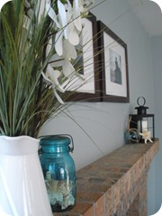
A wedge of green floral foam, a few stems of grasses, white orchards, and pussy willows and my pitcher was complete. What’s funny is that after I brought it home, I revisited Layla’s spring mantel post and realized that it is in fact the exact same Martha Stewart white pitcher that she bought a a thrift store too. Why are people tossing such a pretty pitcher?

P8040468

Another trip a day or two later yielded the antiqued turquoise Ball canning jar. It’s even a fancy Bicentennial jar from 1976. A total treasure for like a dollar.

Another thing I love about thrifting is that it seems so serendipitous all.the.time. I always seem to find exactly what I am looking for when I only have a vague idea of what I want and I always seem to find related things all in the same or trip or two.

P8040469

As for the lantern, I snipped the ribbon, washed it, unscrewed the candlestick piece and stuck a pillar in it. Didn't even need to spraypaint this baby. I even left the rusty bits for authenticity. Done.

P8040467

Some seashells and a decorative glass floater from the craft store and my mantel decorations were complete. I probably spent like maybe $25 total.

P8040472

So here’s to you, Pottery Barn.

And your $40 pitcher.

PB Great White Pitcher 39

With your $50 lantern:

PB Capr Lantern 50 100

I kept the artwork clean and simple. Two walnut-stained, white-matted frames from Target and two black and white 8x10s from our San Juan Islands getaway last month.

Here’s the full-frontal shot with our fifth-time’s-a-charm wall paint color:

P8040473

I know, I know. More chunky white candles of varying heights and a scattering of seashells could totally be added, but I am going to keep it simple for now.

We love how the paint choice came out. It comes off as a little more grey-blue than grey or grey-green-blue as the paint chip seemed. But I can’t get enough of it. I heart it.

Future projects (besides new flooring :-) include painting out the brass “accent” with high-temp black, an idea picked up from many bloggers also in possession of mid 1990s subdivision homes.

Not sure if I will attempt a fall mantelscape- this one was enough for me for a while. Hopefully, though I can pull something together for the winter season.

Wednesday, June 23, 2010

Adventures in paint samples, part two

Yeah, the *perfect* green turned out to be not so perfect for the kitchen / family room. And here I was thinking green all the way, forever.... well at least for the last two months. I was totally stumped if green was out.

I ask hubby for input. I show him all my spreads (man, I love those paint sample books they hand out at paint stores. Not quite official enough to have fancy paint fan decks, but I can spend hours daydreaming over those itty bitty samples.)

He picks a dark grey blue from the Martha Stewart Collection called Shale. I look at it. I love it. I totally agree. The search for the *perfect* green has now become a search for the *perfect* blue grey. Martha Stewart certainly has some dreamy greys with all sorts of undertones. Here are some of her blue-ish greys:


A close-up of the Shale:


Some searching around revealed this amazing kitchen in what looks to be pretty darn close to the Shale and the exact feel I wanted all along with my kitchen too. This is by seasideinteriors on Rate My Space.


Here's her living room. To.die.for. Am I right?

She used Benjamin Moore's Pike Peak Grey for the walls and Cloud White for the panelling.

As much as I love the white cabinets and as much as I know my cabinets are the fabulous shade of early-1990s oak, I am going to resist the total urge to paint them. I would hate for all this white cabinetry hotness to look oh-so early 2010s in just a few years, you know? Like how dark cherry now scream 2004.

So off to the paint department for some blue grey hunting. I managed to walk out of there (I'm sure an hour later) with just three sample bottles, but gathered quite a collection of sample chips, just in case, just for comparison. So here they all are in their glory on my turquoise countertops....


On the bottom right is my short list from top to bottom: Martha's Shale, Glidden's Dusty Miller (which has some green undertones as well) and Behr's Disney Collection Space Dust (the bottom half). Here they are up on the wall:


Top to bottom: Shale, Space Dust, Dusty Miller, Celery Sticks (from paint sample round 1), more Shale.

The winner is...Glidden's Dusty Miller.

I still love, love, love the Shale, but am worried it would be too dark without white cabinets, the Space Dust was too light blue not enough grey. For some comparison, the Dusty Miller is very similar to Martha's Winter's Day, which gives you a good idea of how it stacks up to similar shades.


Now that I am BFFs with the Home Depot paint department, they let me know a rebate offer is coming this weekend on paint gallons so to wait a few days.

Being that crazy, million paint sample girl is starting to have its perks...

Monday, June 21, 2010

Adventures in paint samples

Our eat-in kitchen and family room are open to each other and yet also separated off from the formal living and dining rooms, so I want to use the layout as an opportunity to create a space that was fun and a little bold in color. I was envisioning a celery green (wall), navy blue (couch), sandy tan (countertops), and pop of turquoise and orange (throw pillows) color palette. Very much like this inspiration board from The Craft Begins:


I searched high and low for some inspiration:

Design*Sponge

Kathycolorado from Rate My Space

Country Living


I couldn't find the exact color scheme I had in mind but I still was totally digging the inspiration board. So, I chewed on it and thought over it for weeks before coming down to two yellow-y celery-y greens that definitely weren't mint-y or sage-y. I arrived at Glidden's Spring Cactus and Celery Sticks:

Of course, though, they look totally sage-y in these photos :)

I originally thought I was going to paint the entire house in Behr colors. I love the variety of colors, the cost is a solid mid-range price point, and Consumer Reports rates them quite high. But the ease of pre-mixed sample bottles drew me to Glidden. And I love their shades: very muted, cool tones. Though I must say they have far fewer number of colors readily accessible with sample cards and bottles. But in some way that makes choosing actually easier- the Behr selection is pretty overwhelming, I will admit. I loved Glidden's Navajo Sand so much I bought a 5-gallon bucket for our formal living room, dining room, hallway, and stairwell, and was quite impressed with its coverage and color.

However, the second I put both the greens up on the wall in our kitchen and family room, I was not won over. And still wasn't after it dried. And still wasn't after I put it in a few different places around the space. Some how it just.didn't.go. You know? I asked the hubby what he thought, and he totally agreed.


They just looked wrong for the look we are trying to create. So it was back to square one. Best $6 mistake I think I ever made. I *big, pink, puffy heart* those little sample paint bottles.
Blog Widget by LinkWithin